
Design Tricks That Make Your Glass Bottle Look Premium Without Blowing the Budget
- Abdul Haq
- Mar 14
- 2 min read

Everyone wants that premium look. Heavy glass, clean decoration, something that feels expensive the moment someone picks it up.
But here’s what most brands eventually realize: premium packaging is rarely about spending more. It is usually about knowing where perception comes from and putting budget there instead of everywhere.
A few smart design choices can dramatically improve how your packaging feels without pushing tooling, material, or decoration costs out of control.
Weight Placement Matters More Than Total Weight


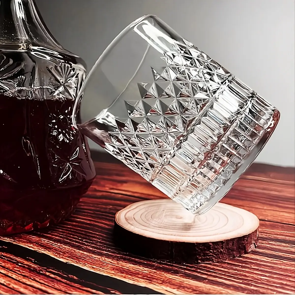
When people say a bottle feels premium, they are often reacting to weight. But making the entire bottle thick increases cost fast and can complicate production.
A thicker base usually achieves the same perception:
Feels solid in hand immediately
Improves shelf presence
Controls raw material cost
Keeps production more stable
It is a small design tweak with outsized impact.
Embossing Quietly Signals Quality


Surface printing has flexibility, but embossing often feels more premium because it becomes part of the bottle rather than decoration sitting on top.
Long term advantages:
No recurring print cost
No fading or scratching
Adds tactile branding
Feels intentional and refined
For products expected to run long term, embossing often ends up being both aesthetic and economical.
Partial Frosting Usually Looks Better Than Full Frosting


Full frosting is popular, but selective frosting often looks more sophisticated and costs less.
Examples that work well:
Frosted base with clear upper section
Gradient matte finishes
Frosting used to highlight logos
Contrast between textures instead of covering everything
Sometimes restraint creates a stronger premium impression than full decoration.
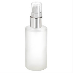
Closures Are Often the Real Luxury Signal


Customers interact with the cap before anything else. A well designed closure can elevate even a simple bottle.
Small upgrades that make a difference:
Heavier plastic caps instead of thin shells
Metal sleeves rather than full metal construction
Magnetic closures for fragrance lines
Matte or textured finishes for grip and feel
This is often a better investment than increasing bottle complexity.
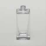
Simple Shapes Usually Age Better


Complex shapes can look exciting initially, but they tend to:
Increase tooling cost
Slow production cycles
Raise defect risk
Date visually faster
Clean, balanced shapes usually communicate confidence and longevity. Many premium brands intentionally keep bottle geometry simple for this reason.
Good Design Is Often About Restraint
One of the biggest misconceptions is that more decoration equals more luxury. In reality:
• Precise logo placement matters more than size• Negative space enhances perceived quality• Balanced proportions beat visual clutter• Consistency across SKUs strengthens brand identity
Premium packaging rarely shouts. It usually speaks quietly.
Final Thought
Great glass packaging sits at the intersection of aesthetics, manufacturing practicality, and cost awareness. When those three align, the result feels effortless even though a lot of thought went into it.
That balance is exactly what experienced sourcing partners aim for. It is also why teams like Sourcing Spectrum tend to focus less on flashy upgrades and more on the subtle design decisions that actually shape how customers perceive quality.
Because in the end, premium is not about how much you spend.It is about what people feel when they hold your product.


Comments